

Problem:
Teachers were spending too much time grading assignments and quizzes. They needed a way to grade faster and provide meaningful feedback to their students, often away from their desk or office.
Goal:
Give teachers a way to quickly view and grade student assignment submissions.
The tool needed to accommodate a variety of submission types (documents, quizzes, essays). Teachers need to be able to annotate or 'mark-up’ student submissions and provide comments to students about their submissions. Teachers need to be able to grade quizzes 'one question at a time' or ‘one student at a time’.
Process:
I was new to this space, so I began by doing as much research as I could to understand the things teachers deal with – what their lives and and work-life balance was like, and all the demands they balance throughout a typical week and semester.
I found a few key things that guided my initial designs: teachers were currently grading during gaps in between other commitments, they needed constant access to grading assignments and they could spend upwards of thirteen hours in a single day grading if they needed.
Results:
I produced a concept for a speed grading feature that was optimized for mobile devices. I chose mobile first because teachers were always in between other commitments and needed to squeeze in time to grade. The system could auto-grade standardized questions, so I focused more complex things. For instance, the designs allowed teachers to easily compare students and answers by swiping left and right and auto-feeding the next items. It also allows teachers to provide feedback on submissions with a few simple taps and synced progress across devices to continue wherever they left off when interrupted throughout the day. I made the visual and interaction designs more fun too, so that time they were spending grading didn’t feel so much like work.
Here are a handful of my initial sketches to tackle the assignment. I began by framing the problem and requirements and jotted down assumptions based on educator blogs about grading I had reviewed (top left). Next I moved in to general ideas about displayable and actionable elements of the application that would support teachers in grading quickly (top middle). The rest of the sketches capture early ideas about navigating the application interface, interactions and visuals that might display, and key questions that I had – such as how to simplify the interface and nav to speed up grading. Last, I explored possible other ideas for the grading mechanism and some pros and cons (bottom right).
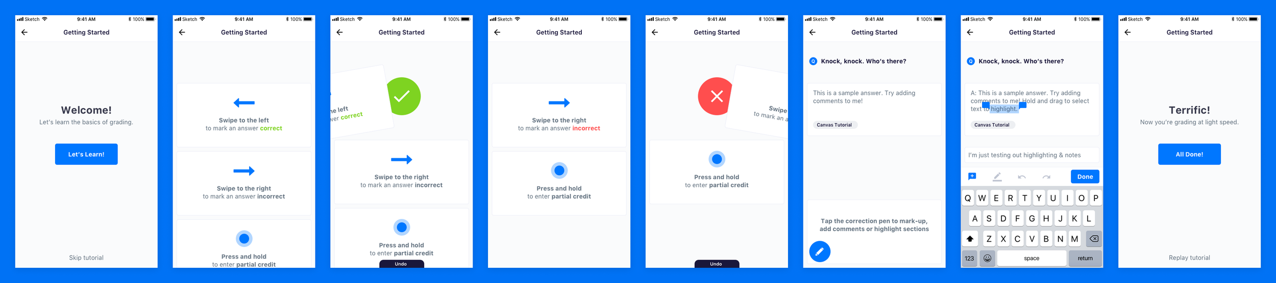
Here are onboarding screens meant to introduce teachers to the speed grading application. The initial concept was around grading one-by-one, swiping left or right, or long press on screen to offer partial and comments. In hindsight a faster method would have been bulk grading, though as this was just a conceptual exercise I focused primarily on expressing interaction design.
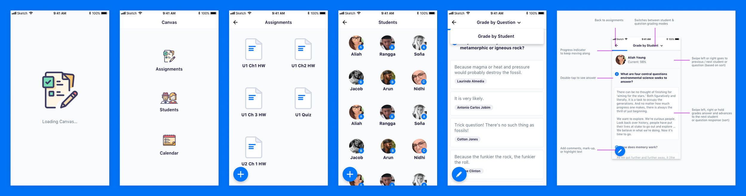
These screens showcase the initial application load and specify how navigation works. From the home screen, instructors can jump to their course assignments for grading, their student list to view grades, or their calendar of classes. The far right screen highlights how the screen UI works.
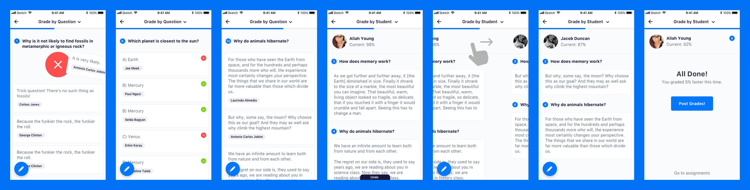
Here are a handful of screens to show how the speed grading application might work in practice. Take a look at the students’ responses – we might learn something from them!