


Problem:
Library users (a target group for the product) want to use our mapping tool to identify opportunities for library growth by comparing their existing patrons’ demographics, behaviors and interests to those of a geographic segment such as their surrounding community.
However, our mapping tool was limited in features and had technical constraints that limited the amount of data we could show at a given time.
Goal:
Create an easy way for library users to understand what their communities looks like in our mapping tool, view their patron distribution, find gaps in coverage and discover opportunities for growth based on characteristics similar to their existing patrons.
Process:
I began this project by interviewing library customers and prospective customers to understand their needs. Once the qualitative data was collected, I created skyscraper mental models to identify opportunities to tailor our product features to the target users’ needs. This also helped to validate or invalidate previously planned product features in order to efficiently allocate our product design resources.
Then I sketched and wireframed initial UI layouts and conducted tests to determine which UI would be easiest to understand and most flexible for the variety of tasks needed to be completed. Once I gained feedback validating a strong direction, I built out the remaining wireframes, prototyped and tested interactions over many iterations.
Result:
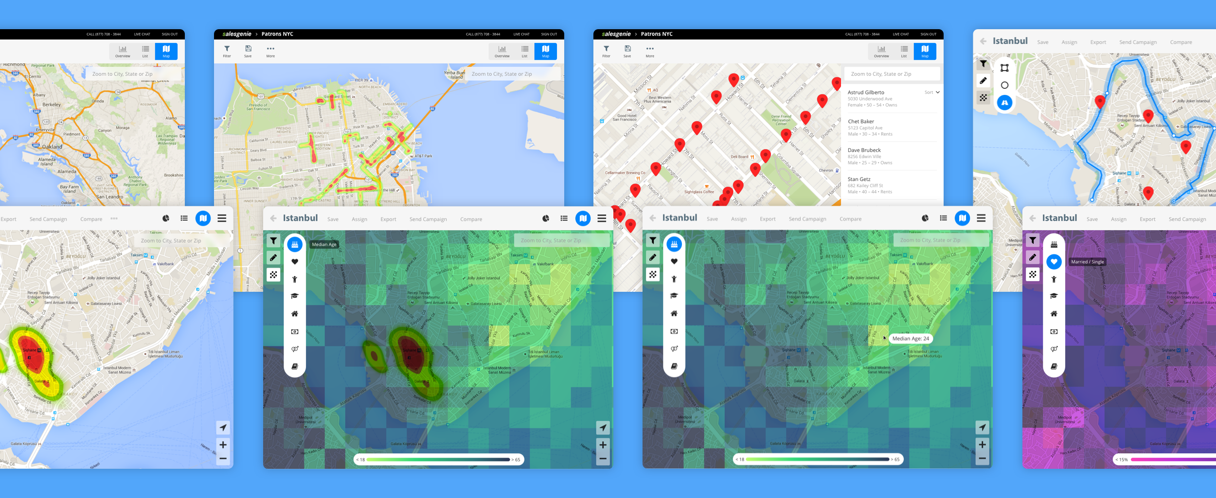
The map is now an interactive, customizable tool that provides users with insights into the characteristics that make up a population. Users are able to view the geographic distribution of their patrons.
The result has been welcomed by our target users and we have gained many new accounts with these improvements. We have been adding more mapping features (such as drive routes for field salespeople – another target user) and the UI system created for this project has been able to be reused as the foundation of our design system.
After interviewing users, I broke up their generalized tasks into explicit activities they conduct or milestones they reach throughout a jobs-to-be-done framework. Tasks were assigned to the users' mental stages throughout performing their job. Then, proposed features were plotted below each relevant mental stage.
This helped us to identify where there were opportunities or pain points to address when building the product. It also helped to validate and invalidate work that was proposed prior to deeply understanding our users' needs.
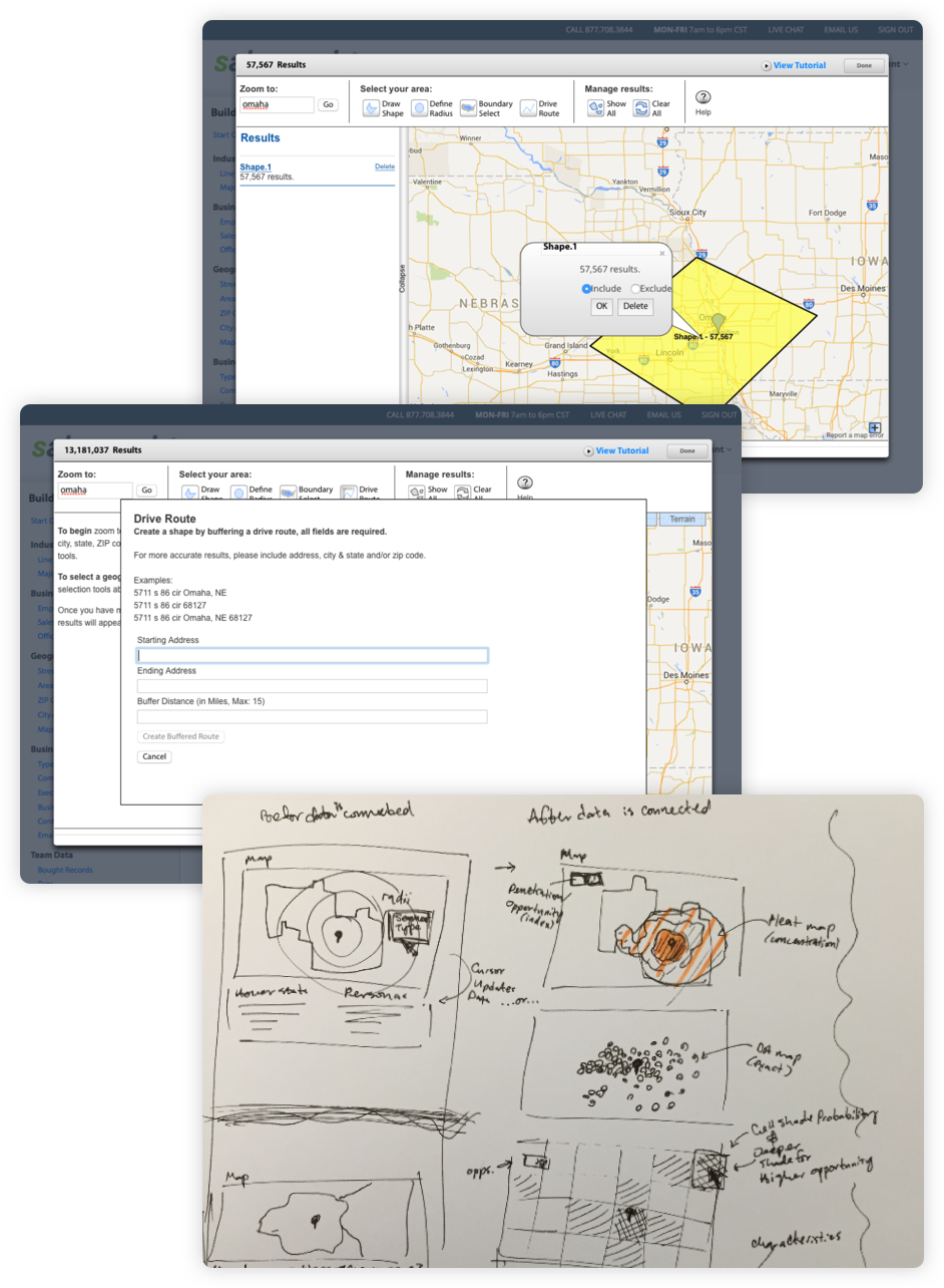
Top: The original map in Salesgenie would only show the number of records in a given area, not the distribution. This made it difficult for users to understand where their patrons were concentrated in a selected area.
Middle: All methods of interacting with the original map tool were executed via dialogue boxes. This disconnect made it difficult for users to understand how their inputs, selections, etc. modified the map. To fix this, I moved the controls directly into the map interface, so users can see their changes on the map as they interact with the UI.
Bottom: Some of my sketches depicting the difference between heatmapped locations and exact location pins. Also included is an early idea for demographic overlays.
Users can now toggle overlays of demographics. This helps them see where characteristics similar to their customers or patrons are distributed to discover new opportunities.
The technology underlying our mapping tool is limited to displaying a small number of possible data points at once; giving users little clarity of how a population is concentrated or distributed. My solution plots the highest concentration of data points as a single heatmap point and displays the heatmap until a user zooms more closely and the system can display all available pin points. This helps users see distribution of populations and reduces information overload.